

Project type:
Data Visualization & Executive Frameworks (CMA)
Context:
Industry research translating quantitative insights into executive-level narratives
Scope:
Data visualization, insight framing, executive storytelling, interactive reporting
My role:
Senior Designer, Data Visualization & Narrative Design
Tools:
Illustrator, XD, Excel
Overview
This project focused on translating quantitative research into clear, decision-ready visual narratives for senior marketing leaders.
Working with survey data collected by the Canadian Marketing Association, the goal was to move beyond static charts and create data visualizations that balanced analytical rigour with accessibility, helping complex insights land quickly and credibly.
The Challenge
The research surfaced nuanced perspectives on creativity, performance measurement, and decision-making. However, the raw data alone was dense and difficult to interpret at a glance.
The challenge was to:
• Reduce cognitive load without oversimplifying findings
• Present insights in a way that supported executive discussion
• Balance storytelling with statistical integrity
My Role
I led the visual design and data abstraction for the project, shaping how insights were structured, visualized, and consumed.
This included:
• Translating survey data into clear visual frameworks
• Designing charts and infographics optimized for interpretation, not decoration
• Establishing visual consistency across multiple data types
• Supporting narrative flow from insight to implication
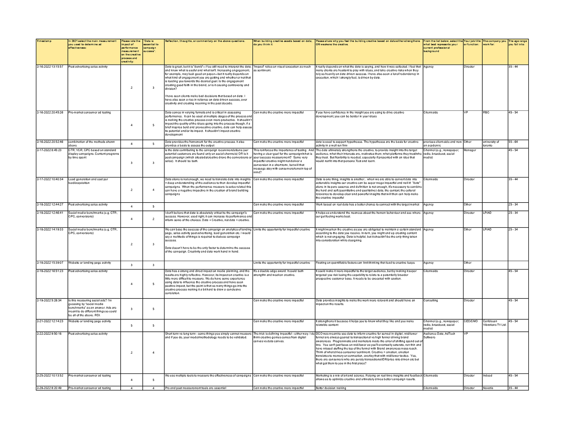
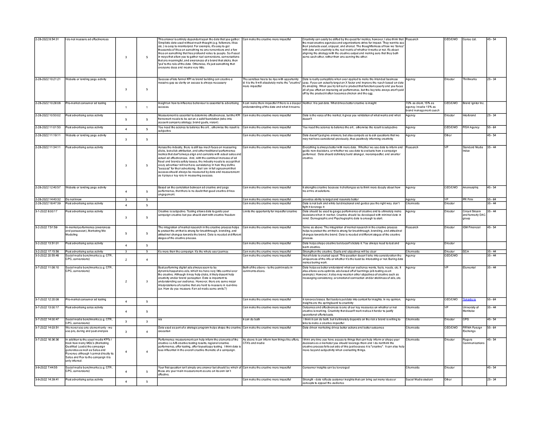
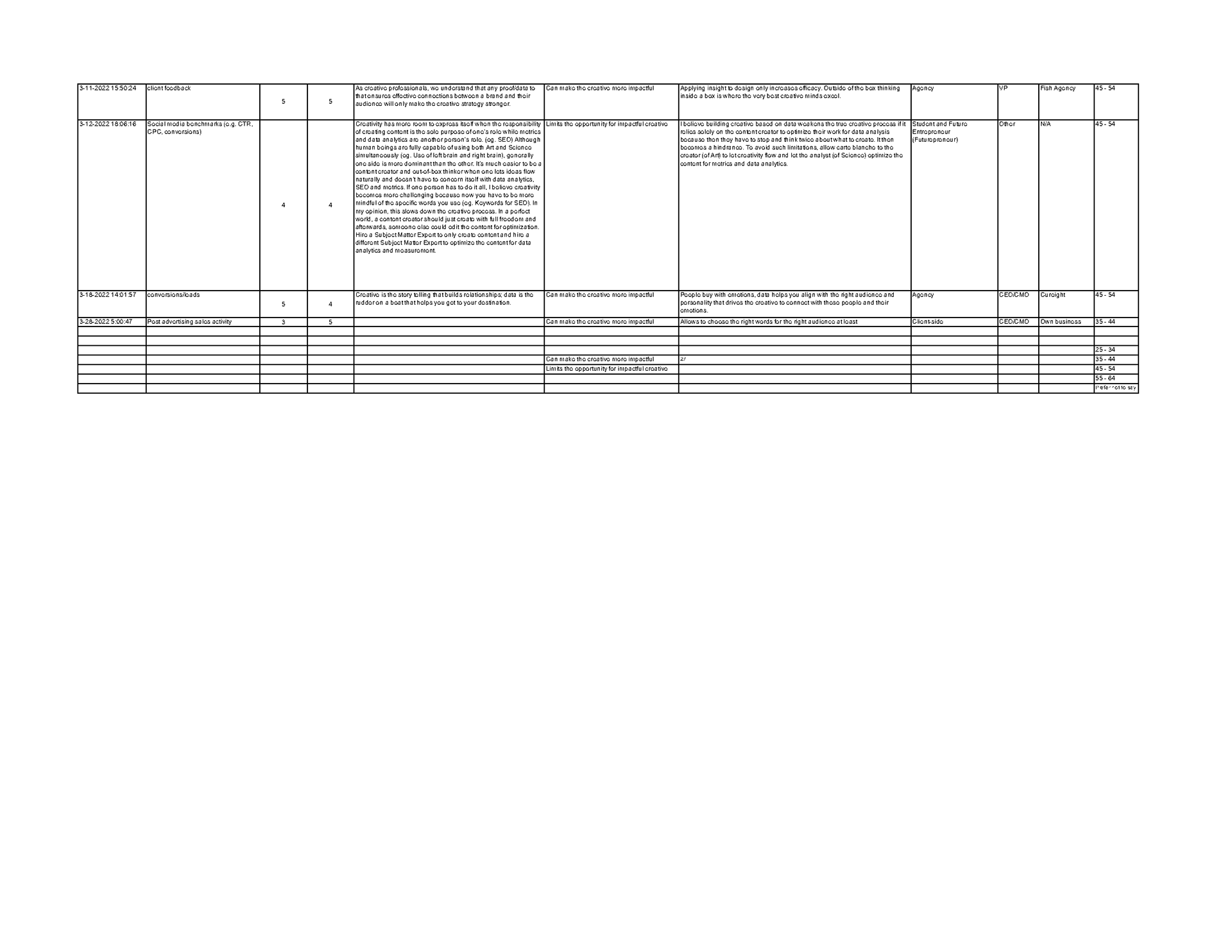
Quantitative Research
The survey was then documented in an excel sheet. Based on the quantitative analysis, the following graphs and charts were then created.
Initial sketches
Here are some of my rough sketches to show the basic layout of the wireframe and a few other key elements.
The Approach
Data visualizations were designed as communication tools, not illustrations.
Key principles included:
• Prioritizing hierarchy and comparability
• Using visual restraint to emphasize meaning over style
• Designing for both live presentation and asynchronous reading
• Ensuring charts supported conversation, not just reporting
Outcome
The final work enabled stakeholders to engage with the data more intuitively, facilitating clearer discussion around creativity, measurement, and performance within the marketing industry.
By structuring insights visually, the work helped bridge the gap between research and action.
Before/After Interaction
These states show the default state vs toggle state in the prototype. You would be able to interact with the prototype yourself to see some microinteractions.
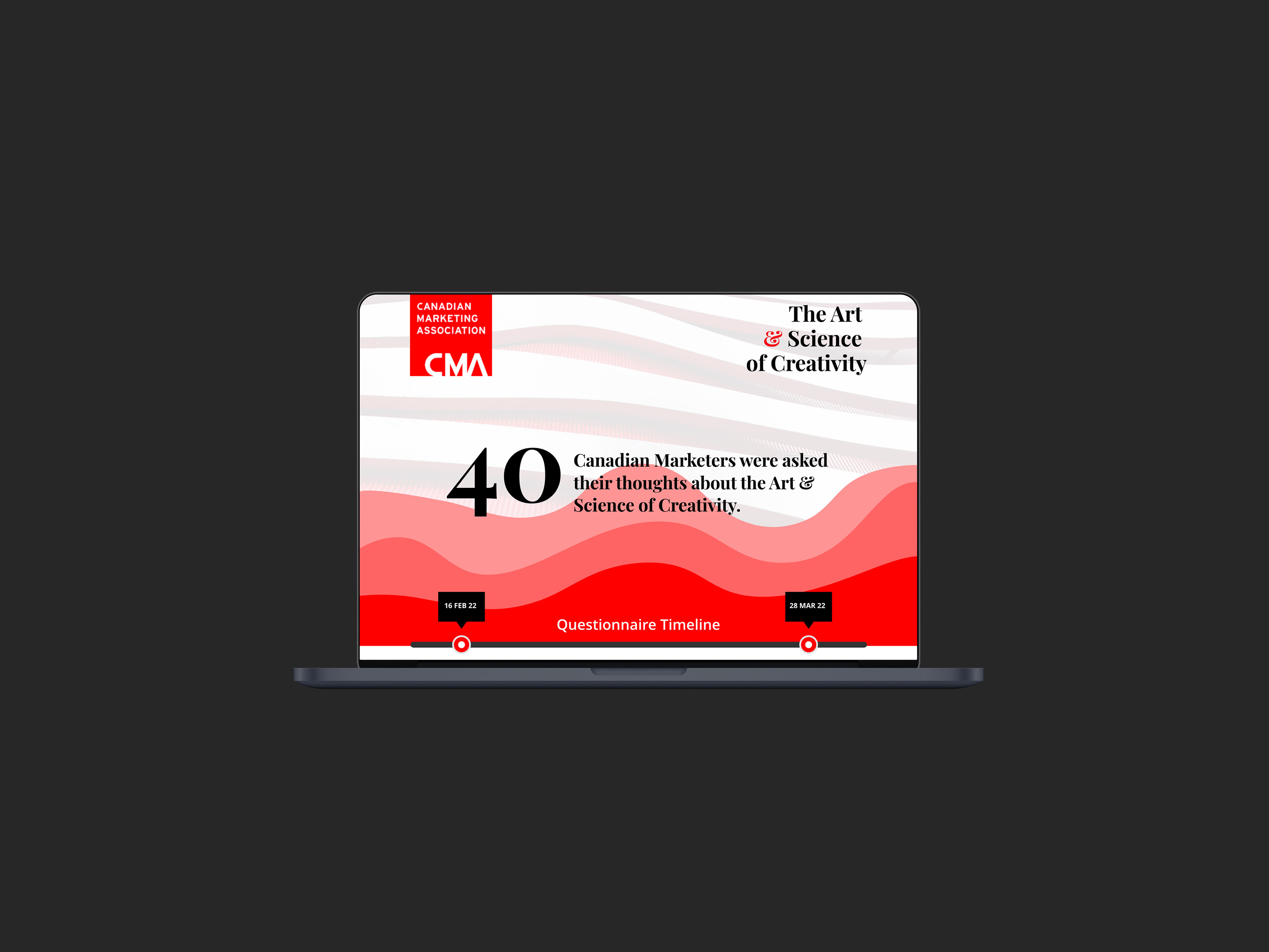
Clickable Prototype
This is a Clickable Prototype designed in an interactive format to make the charts and graphs more lively and vibrant. When the site launches it will have a 3-5 sec intro animation. Once the animation is complete, you would be able to scroll down to view the charts and pointers.
To see the effect per chart you’d need to click on each element. But prior to doing that, make sure to have the section “title” + “chart” in your full viewport. I’ve added a toggle effect to each chart, to reverse the effect to the original state.
Clear data makes better conversations possible.