
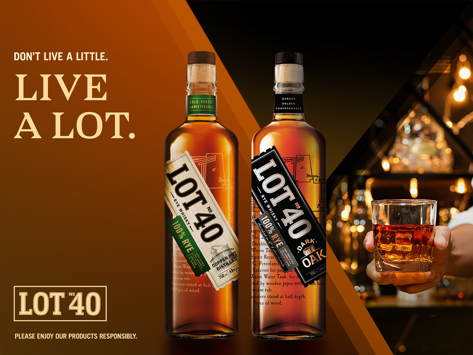
Client:
Pernod Ricard
Brand:
Lot No. 40 Rye Whisky
Project:
Visual Identity Evolution, Key Visuals, POS & Campaign Assets
Team:
LP/AD
My role:
Art Director & Senior Designer
Tools:
Photoshop, Illustrator, InDesign, AI-assisted image generation
Overview
Lot No. 40 required an evolved visual direction that respected its heritage while modernizing how the brand showed up across retail, on-premise, and campaign environments. The challenge was to create a scalable key visual system and clear execution rules that could flex across SKUs, formats, and channels without losing clarity or premium impact.
The Challenge
The brand had strong foundational guidelines already in place, but lacked a contemporary visual system that could unify product storytelling across advertising, point-of-sale, and seasonal campaigns. The work required balancing craftsmanship and authenticity with a bolder, more distinctive shelf presence and campaign expression.
As Art Director, I led the development of the new visual direction for Lot No. 40, overseeing key visuals, layout systems, and execution guidelines. I partnered closely with strategy and account teams to ensure the work balanced brand heritage with modern retail and campaign performance needs.
Creative Direction
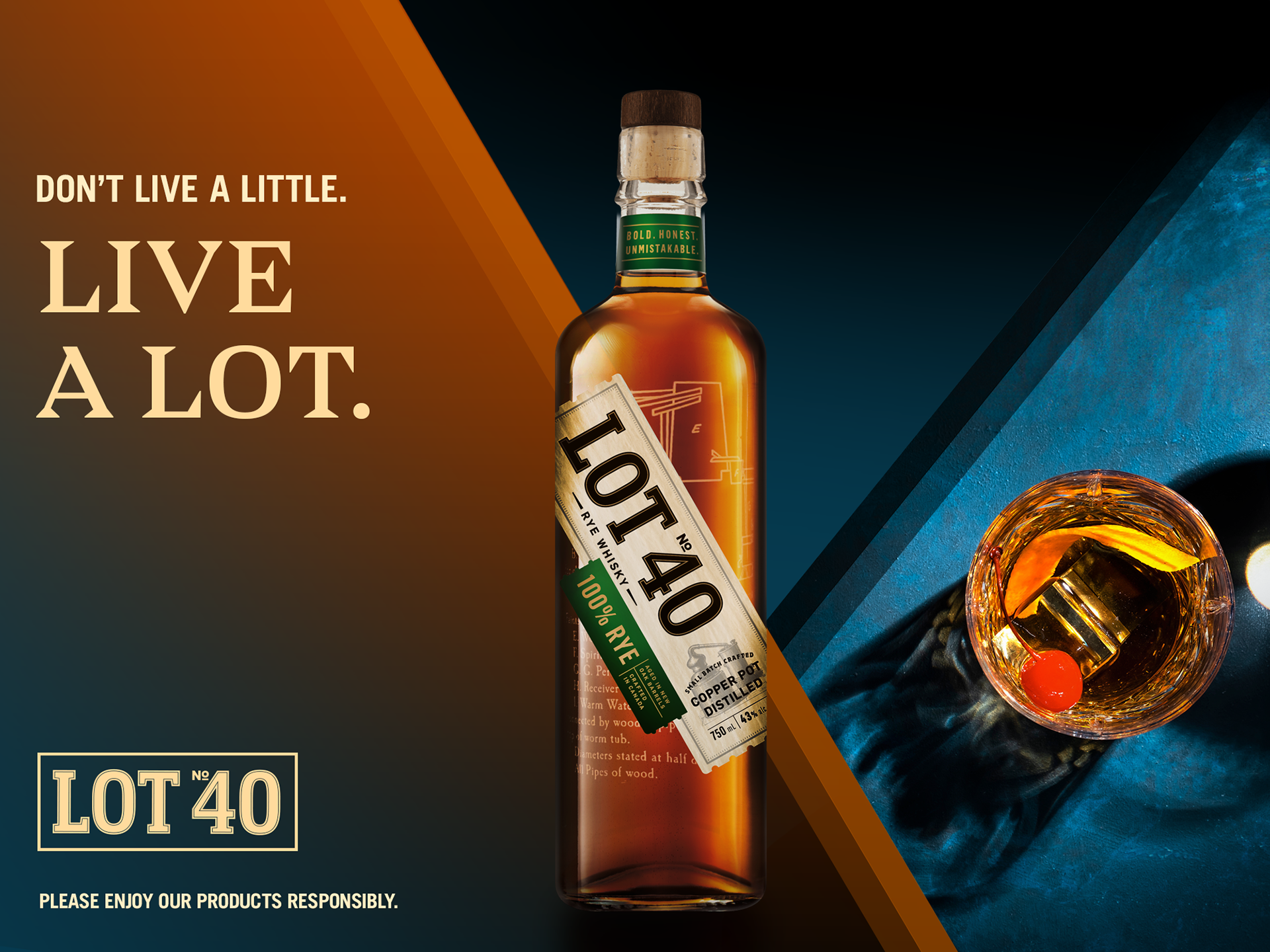
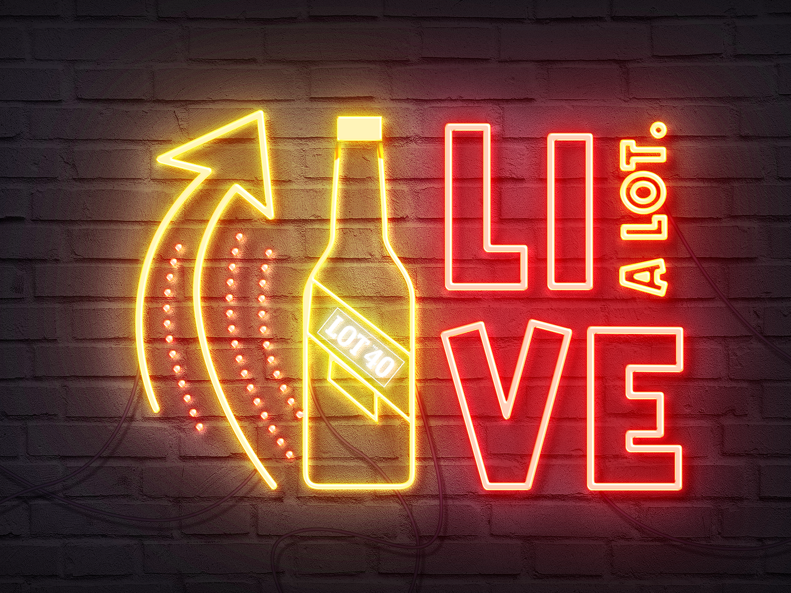
Live a Lot.
The creative idea centred on contrast and character - bringing forward the richness, warmth, and confidence of the liquid while grounding the visuals in bold typography and structured composition. The system was designed to feel unmistakably premium, modern, and versatile across both product-led and lifestyle executions.
The creative idea centred on contrast and character - bringing forward the richness, warmth, and confidence of the liquid while grounding the visuals in bold typography and structured composition. The system was designed to feel unmistakably premium, modern, and versatile across both product-led and lifestyle executions.
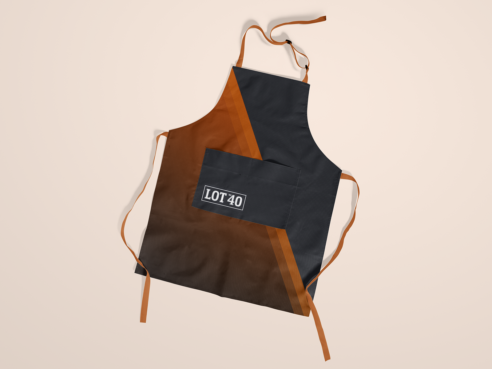
System & Execution
• Defined a new key visual system with primary and secondary executions
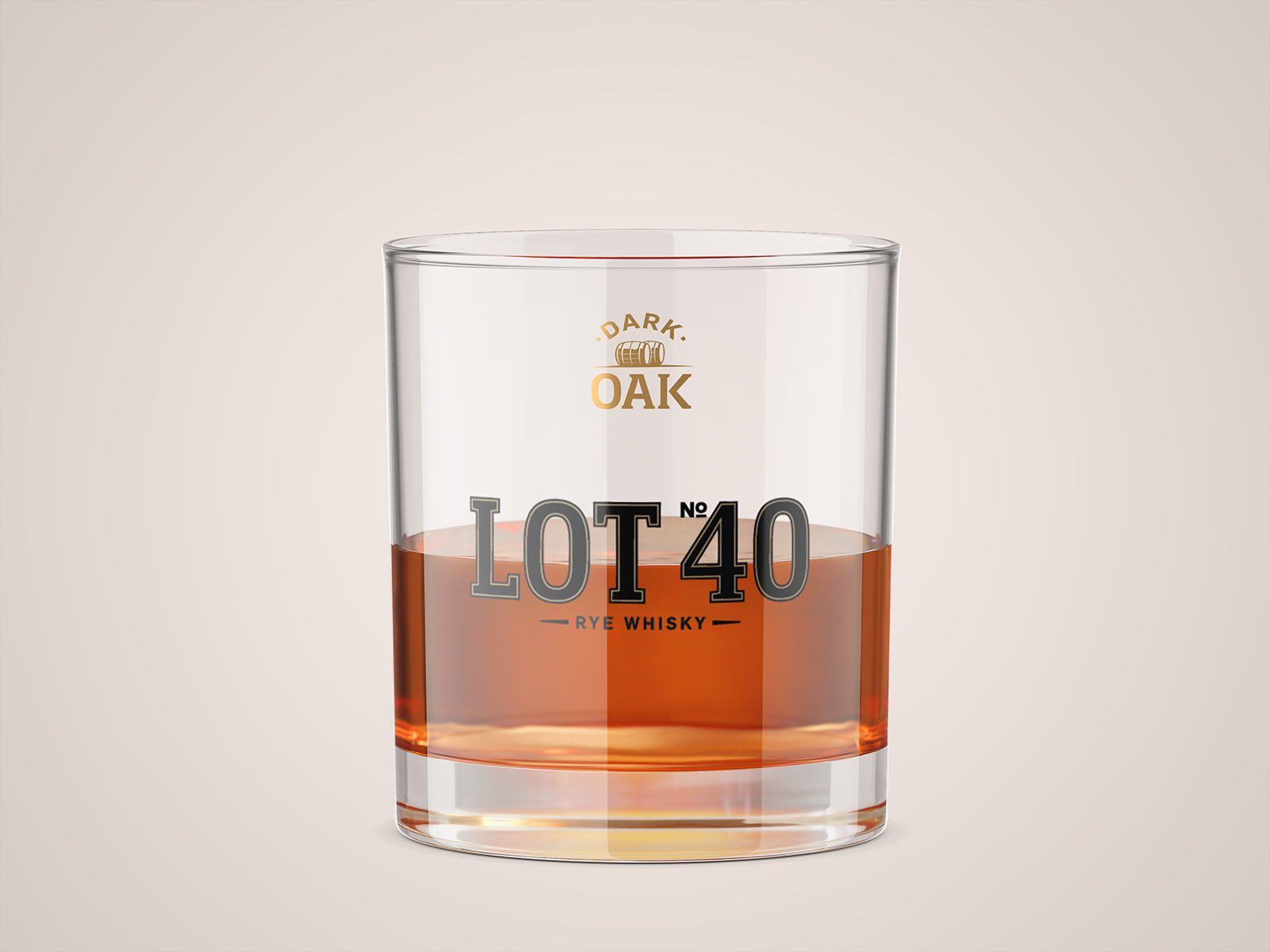
• Art direction for product, glassware, liquid, and lifestyle photography
• Visual rules for typography, composition, contrast, and hierarchy
• POS system including shelf talkers, case cards, price cards, and retail units
• Static campaign assets across portrait, landscape, and banner formats
• Flexible layouts supporting single SKU and dual-SKU storytelling
Impact
• Strengthened the brand’s organic social presence through a more cohesive, expressive visual system aligned with Lot No. 40’s craft-driven positioning.
• Improved content consistency and recognizability across posts, helping the brand stand out in a crowded spirits category.
• Created a flexible framework that allowed ongoing social content to be produced efficiently without diluting brand character.
Outcome
The result was a cohesive, production-ready visual system that elevated Lot No. 40’s presence across retail and campaign touchpoints. The guidelines enabled Pernod Ricard teams to scale executions confidently while maintaining consistency, clarity, and a strong premium brand signal across channels.
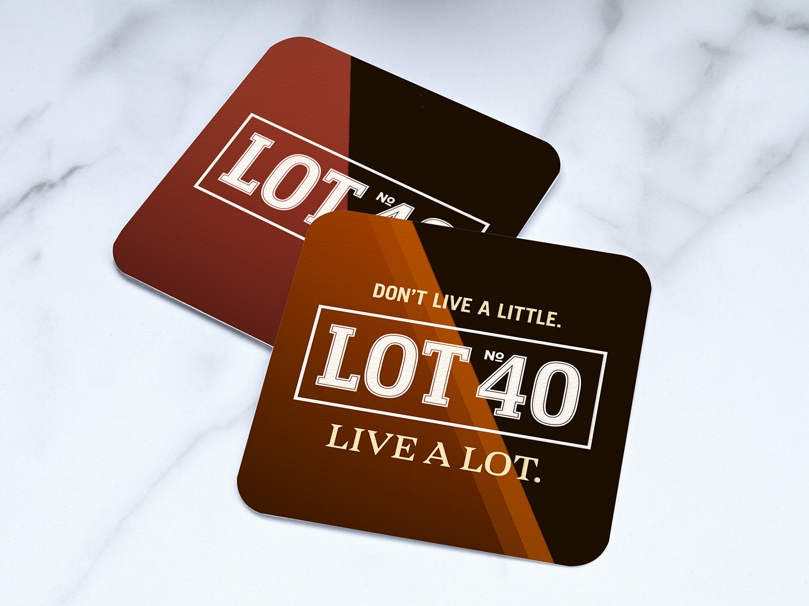
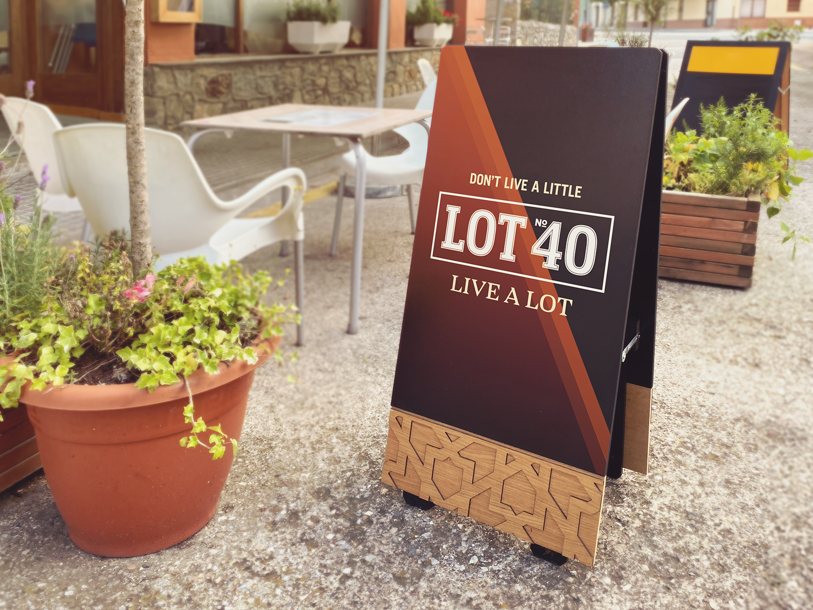
A modern system built to scale - without losing character.