
Client:
Gentrack
Team:
LP/AD
My role:
Designer & Web Lead
Tools:
Figma, Illustrator, Photoshop
Overview
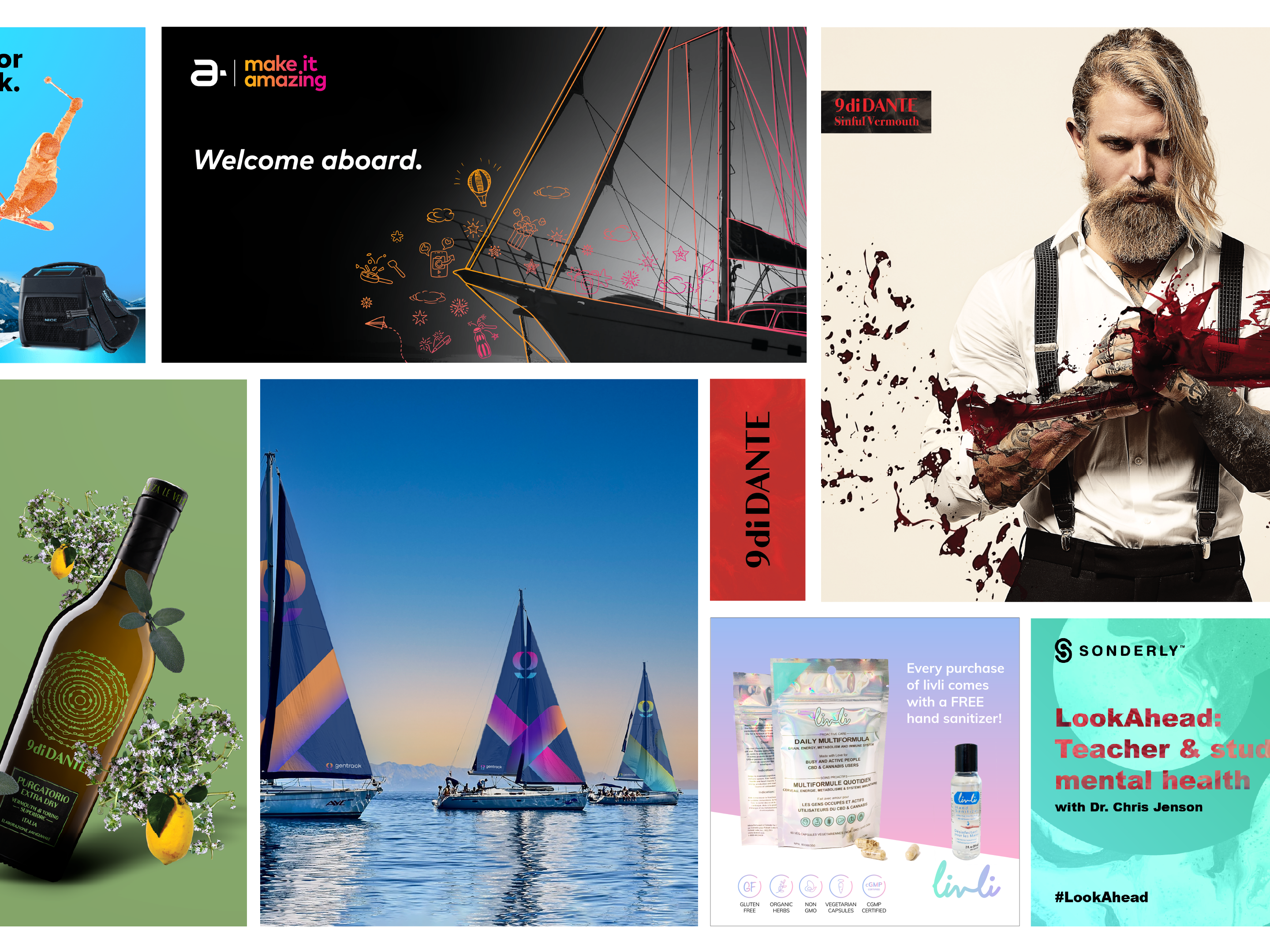
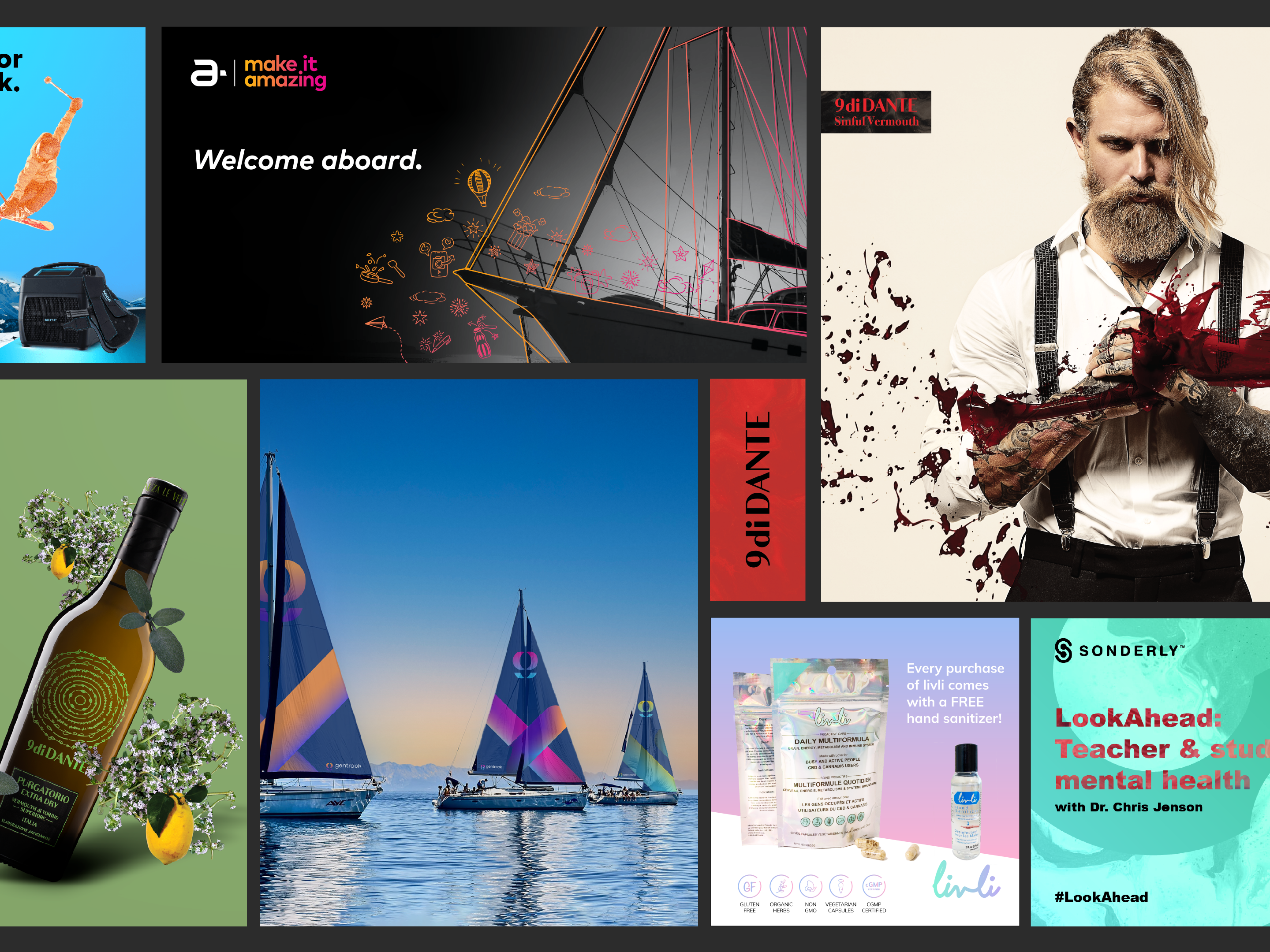
Gentrack is a global cleantech software company working with leading energy and water utilities worldwide. Following a newly defined brand identity, the challenge was to translate the guidelines into clear, consistent, and scalable real-world applications across digital and marketing touchpoints.
My role focused on bringing the system to life, ensuring the brand worked not just in theory, but in practice. From website visuals to campaign assets, the goal was clarity, confidence, and cohesion across every surface.
The Challenge
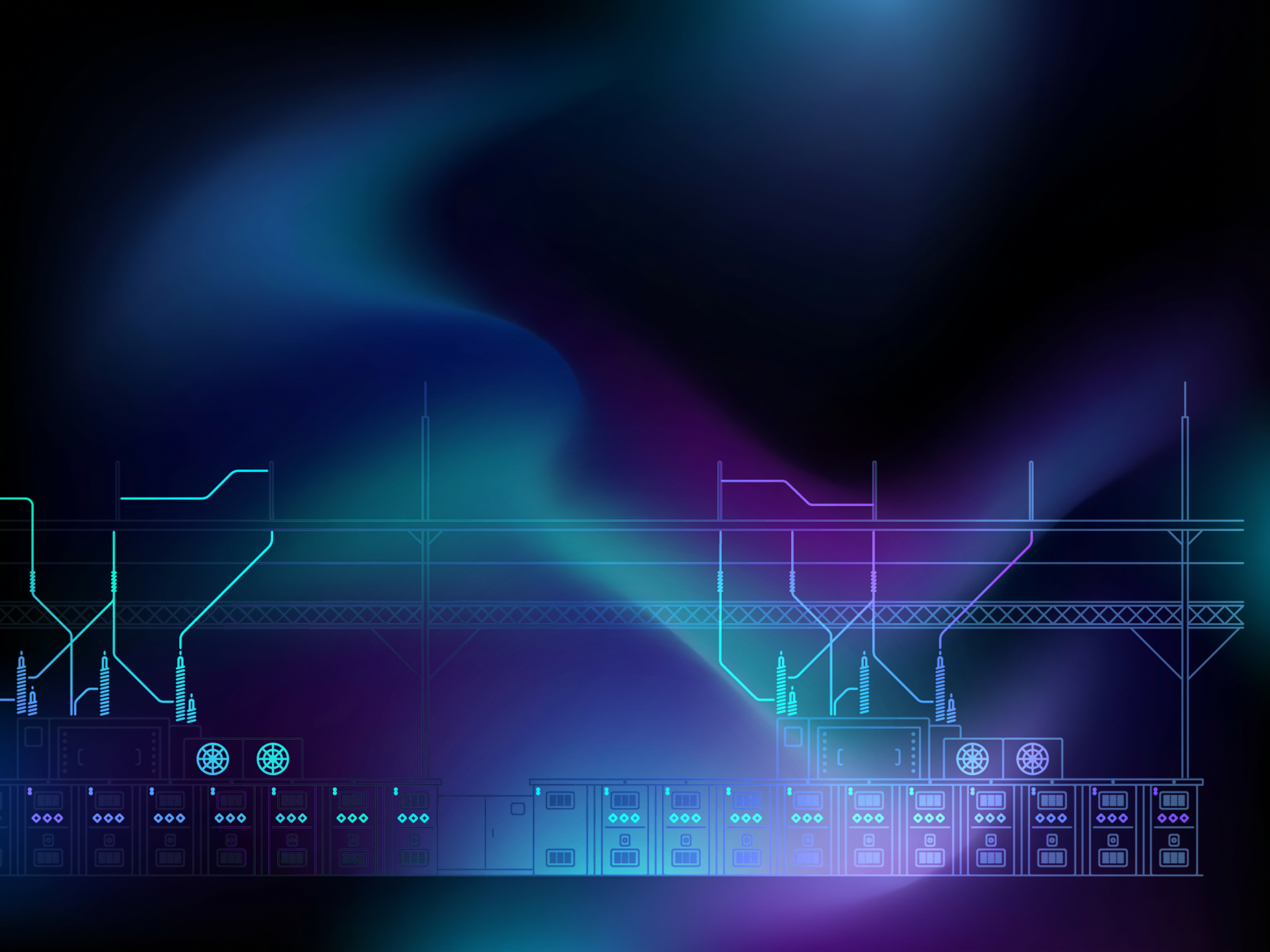
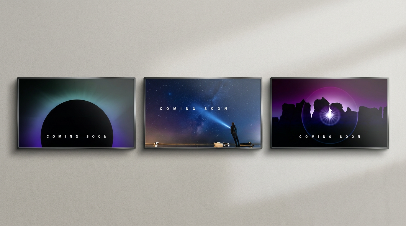
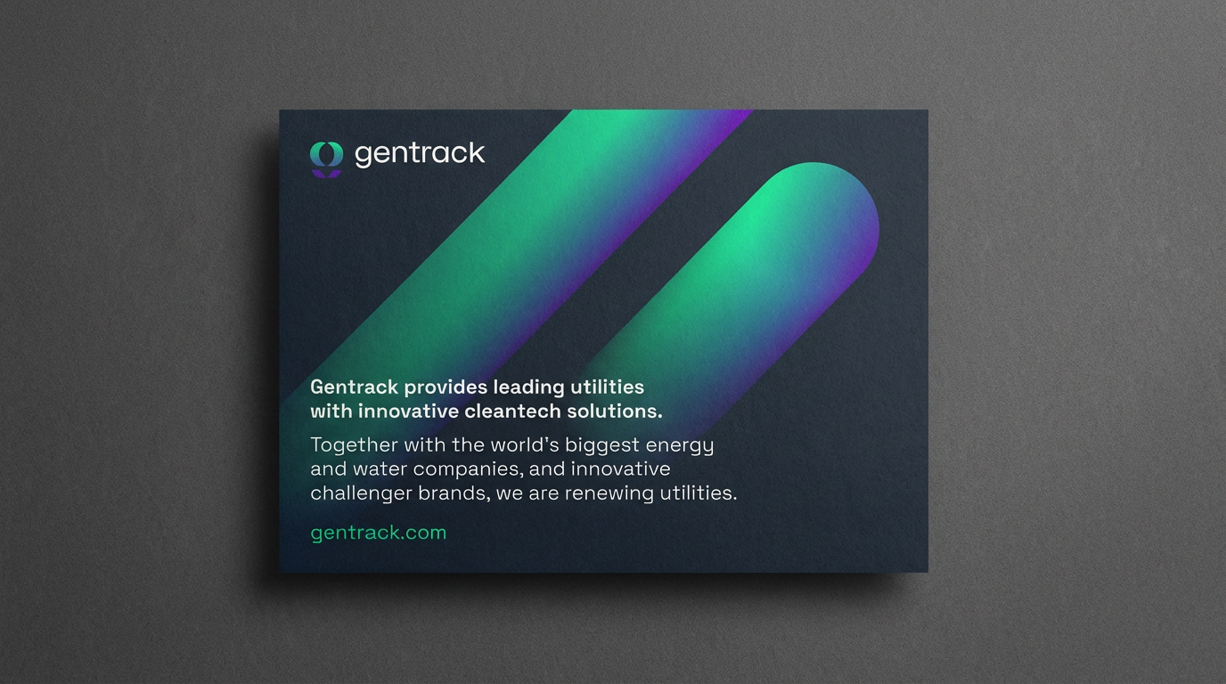
The identity system introduced a bold visual language built around gradients, motion-inspired forms, and a strong colour world. The challenge was applying it without visual noise, especially across complex B2B content where clarity matters more than cleverness.
Every touchpoint needed to feel modern and energetic while still communicating trust, scale, and technical credibility.
Every touchpoint needed to feel modern and energetic while still communicating trust, scale, and technical credibility.
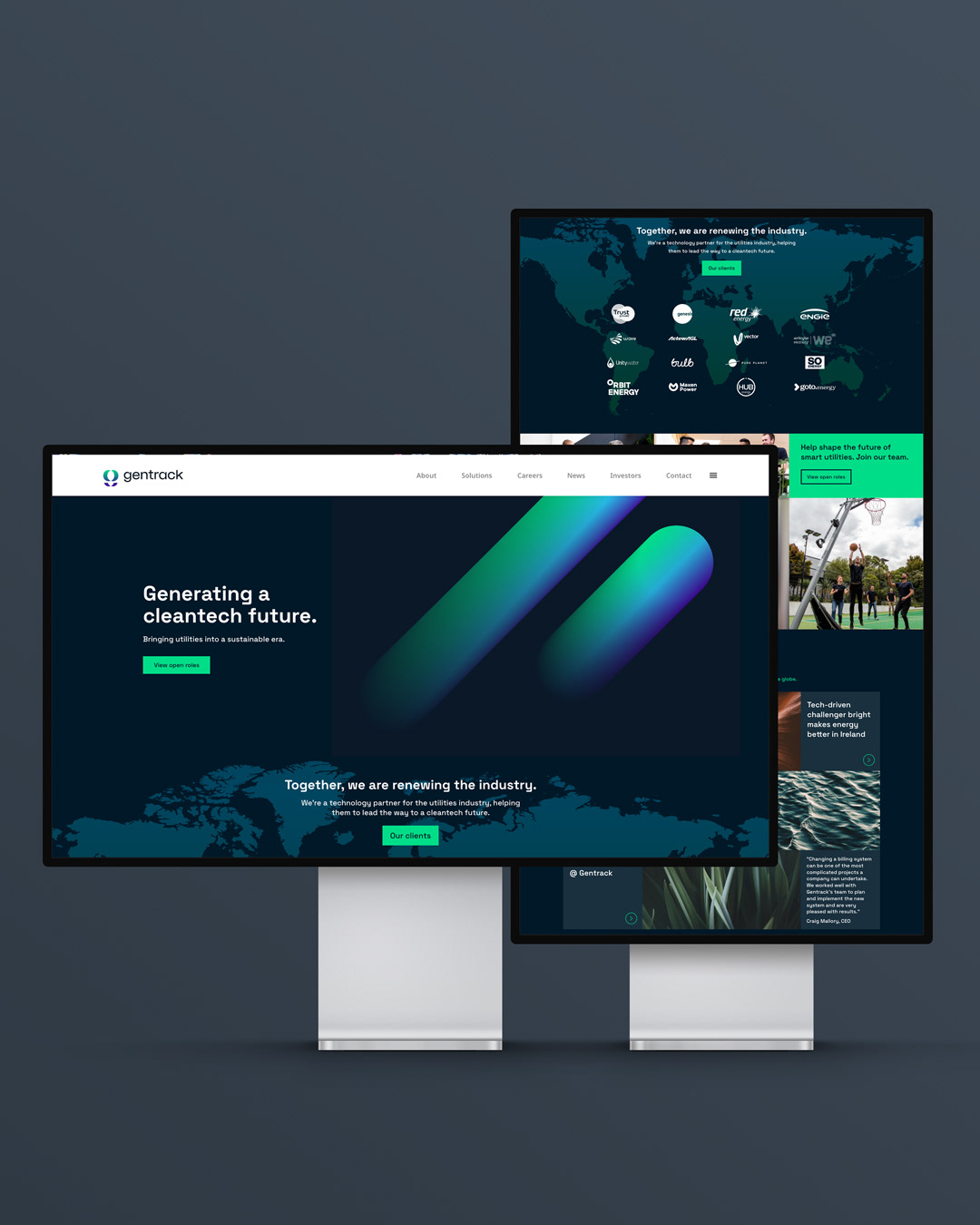
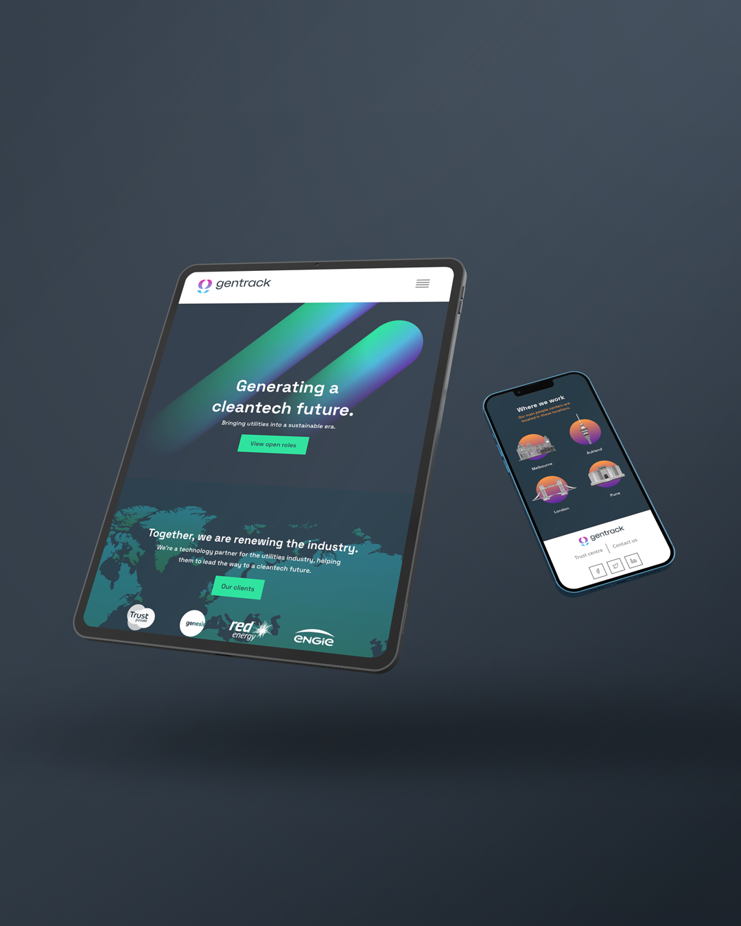
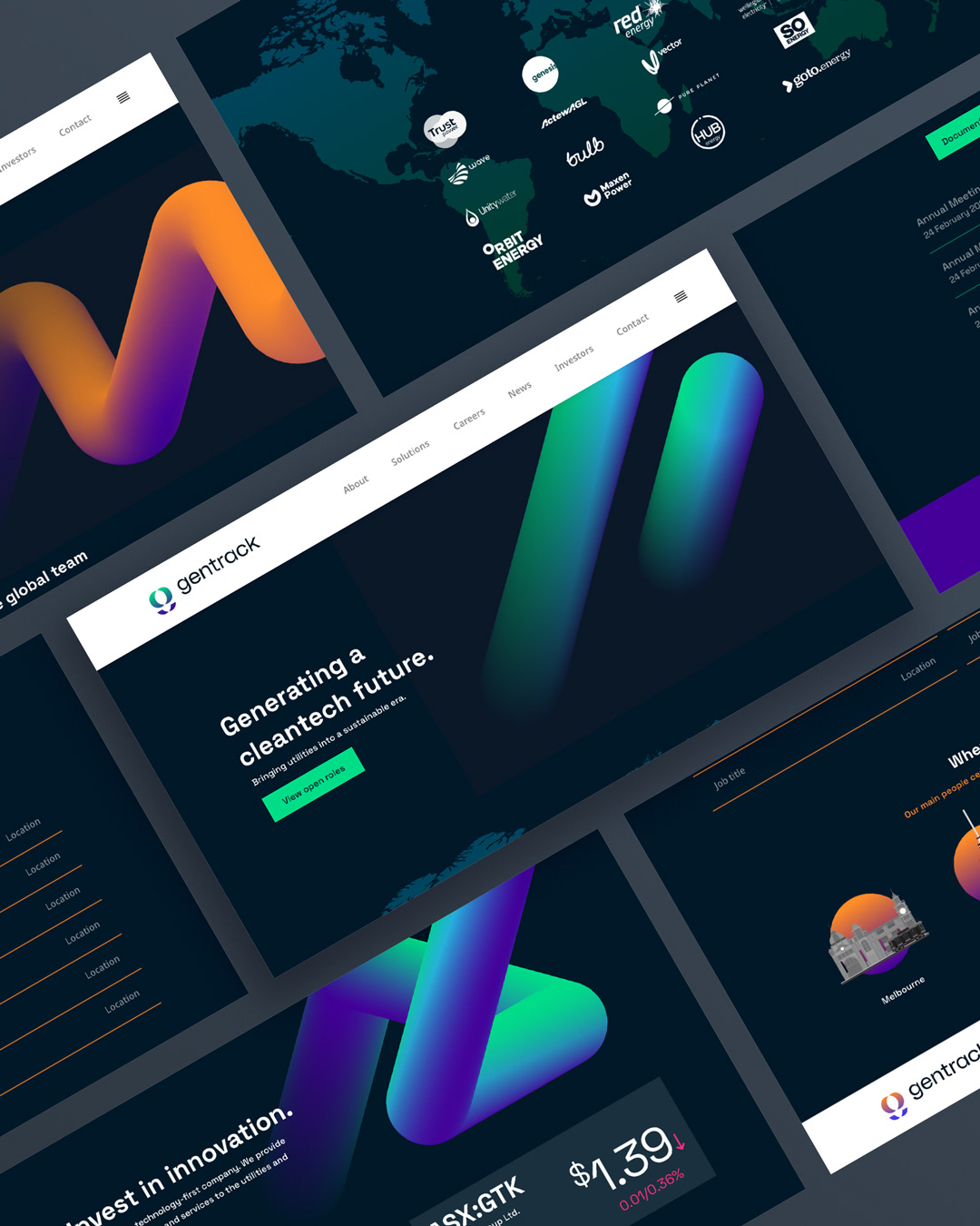
I worked on the execution of Gentrack’s brand system, translating newly defined guidelines into clear, scalable digital and marketing applications. My focus was on applying the visual language consistently across touchpoints, from website layouts to campaign and print assets, ensuring the system felt cohesive, usable, and adaptable in real-world contexts. The work balanced strong brand expression with clarity and restraint, supporting Gentrack’s positioning as a trusted, global cleantech platform.
The Approach
Rather than designing one-off assets, the work focused on system-first execution.
Key principles:
• Respect the integrity of the core brand system
• Use colour and motion cues intentionally, not decoratively
• Design assets that scale across regions, teams, and formats
The result was a flexible design approach that allowed marketing and product teams to move faster without diluting the brand.

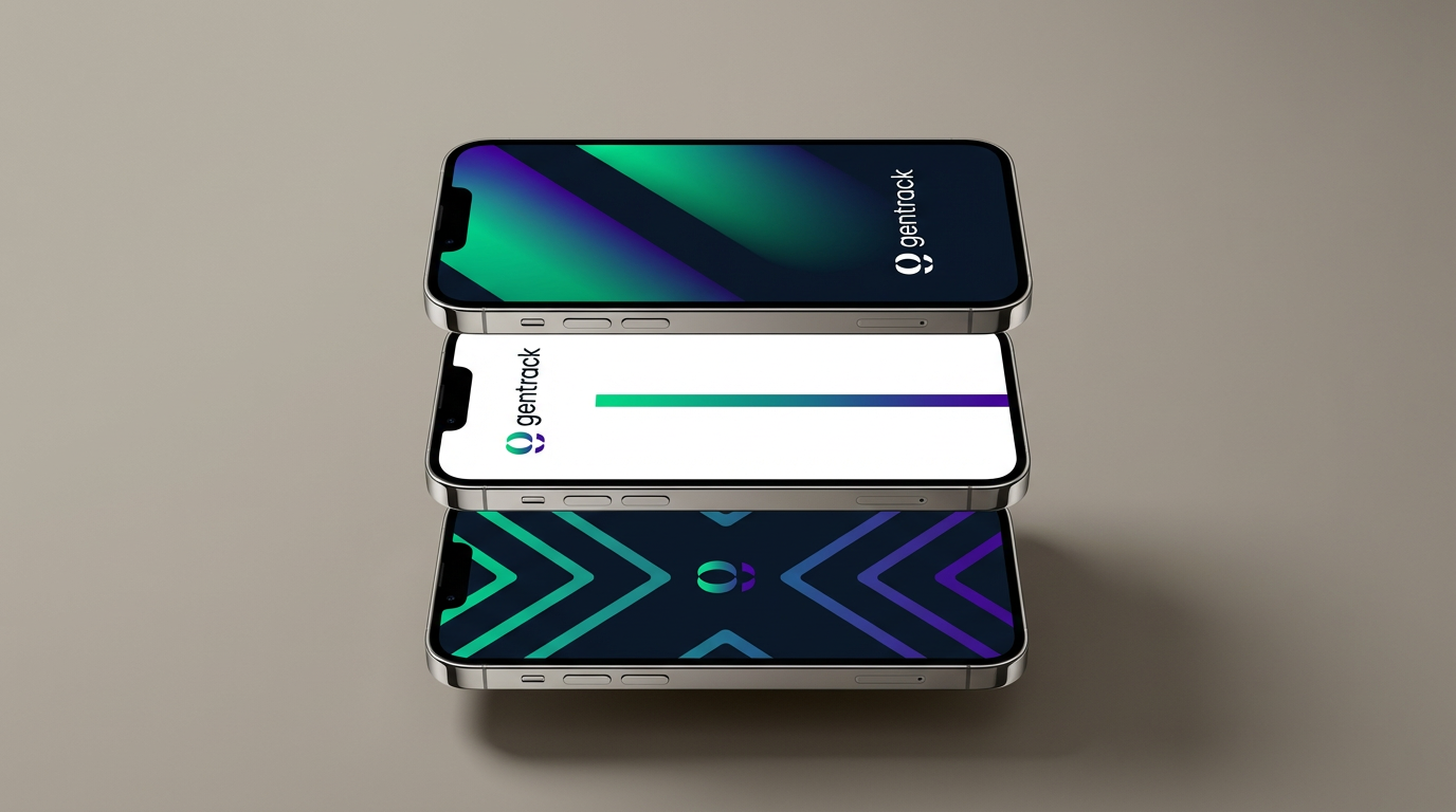
Visual Direction
The visual language balances structure with energy. Gradients and graphic devices are used to suggest motion and transformation, while layouts remain clean and restrained to support complex messaging.
The system reinforces Gentrack’s position at the intersection of technology, sustainability, and scale, without leaning into cliché “green tech” tropes.
Impact
• Created a cohesive visual system that brought consistency to a fragmented set of brand and communication touchpoints.
• Gave internal teams a clear framework to extend the brand without constant redesign or creative oversight.
• Strengthened Gentrack’s visual credibility across both product-adjacent and brand-led communications.
Outcome
The work helped translate a newly defined brand identity into usable, repeatable design patterns across channels. The system supports consistency across markets while remaining flexible enough for ongoing campaigns and digital evolution.
Why This Project Matters
This project highlights my strength in operationalizing brand systems. Not just designing nice things, but making sure a visual identity survives real constraints: deadlines, stakeholders, multiple formats, and global rollout.
It’s the difference between branding as a concept and branding as a working product.
Clean energy. Cleaner execution.