Client:
Jessup University
Project:
Integrated Campaign System, Visual Identity, Program Marketing
Team:
LP/AD
My role:
Art Director & Senior Designer
Tools:
Photoshop, Illustrator, Mid Journey, Firefly, Adobe CC
Overview
Jessup University offers faith-based, online academic programs designed for students balancing career, calling, and real life. The goal of this project was to create a scalable, multi-platform campaign system that could speak to diverse audiences while maintaining a consistent, modern brand presence.
The work focused on translating purpose-driven education into clear, approachable visual and verbal language. Using a modular design system and AI-assisted exploration, the campaign brings warmth, credibility, and flexibility together across direct mail, social media, OOH, program-specific creatives, and conversion-focused landing pages.
The Challenge
Jessup University needed to promote its online programs to a wide range of learners, from working professionals to creatives and faith-centred students. The work had to live across print, social, OOH, and web while feeling cohesive, modern, and human. The challenge was creating a system that could scale across programs and platforms without losing warmth or clarity.
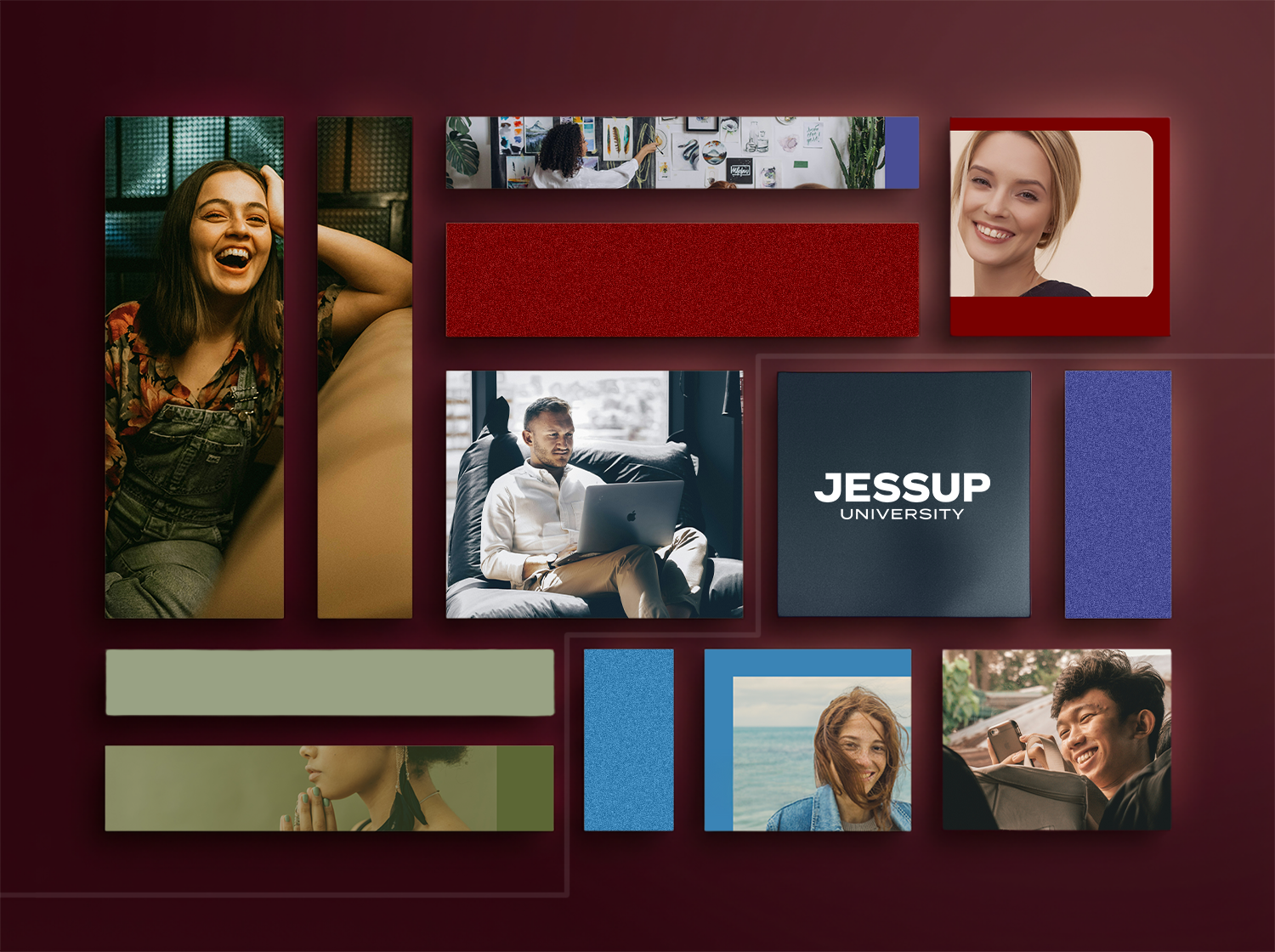
Led the creative direction and design of a multi-platform campaign system for Jessup University’s online programs. The project spanned direct mail, social media, OOH, program-specific creatives, and conversion-focused landing pages, all built within a unified visual and copy framework.
The work focused on balancing innovation, faith-based values, and modern education messaging, while ensuring scalability across platforms and audiences. AI-assisted workflows were used to accelerate ideation, visual exploration, and production refinement without compromising creative judgment or craft.
This project highlights strengths in campaign systems thinking, cross-channel design, art direction, and building modular creative frameworks that perform across brand and digital environments.
The Idea
Education is personal. A program should adapt to a person’s calling, not the other way around.
The campaign was built around this belief, utilizing clear messaging and a flexible design to reflect different paths while maintaining a single, recognizable brand voice.
The Approach
Instead of treating each asset as a standalone piece, the work was designed as a connected system. Every touchpoint supports the next, from first impression to conversion.
Instead of treating each asset as a standalone piece, the work was designed as a connected system. Every touchpoint supports the next, from first impression to conversion.
The campaign included:
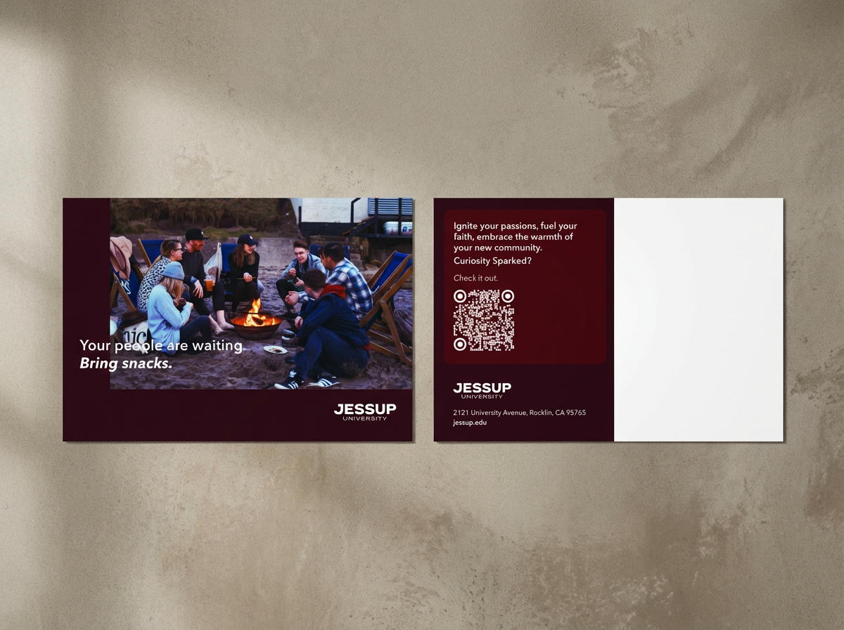
• Direct mail to spark curiosity and drive high-intent traffic
• Social content built around four clear audience pillars
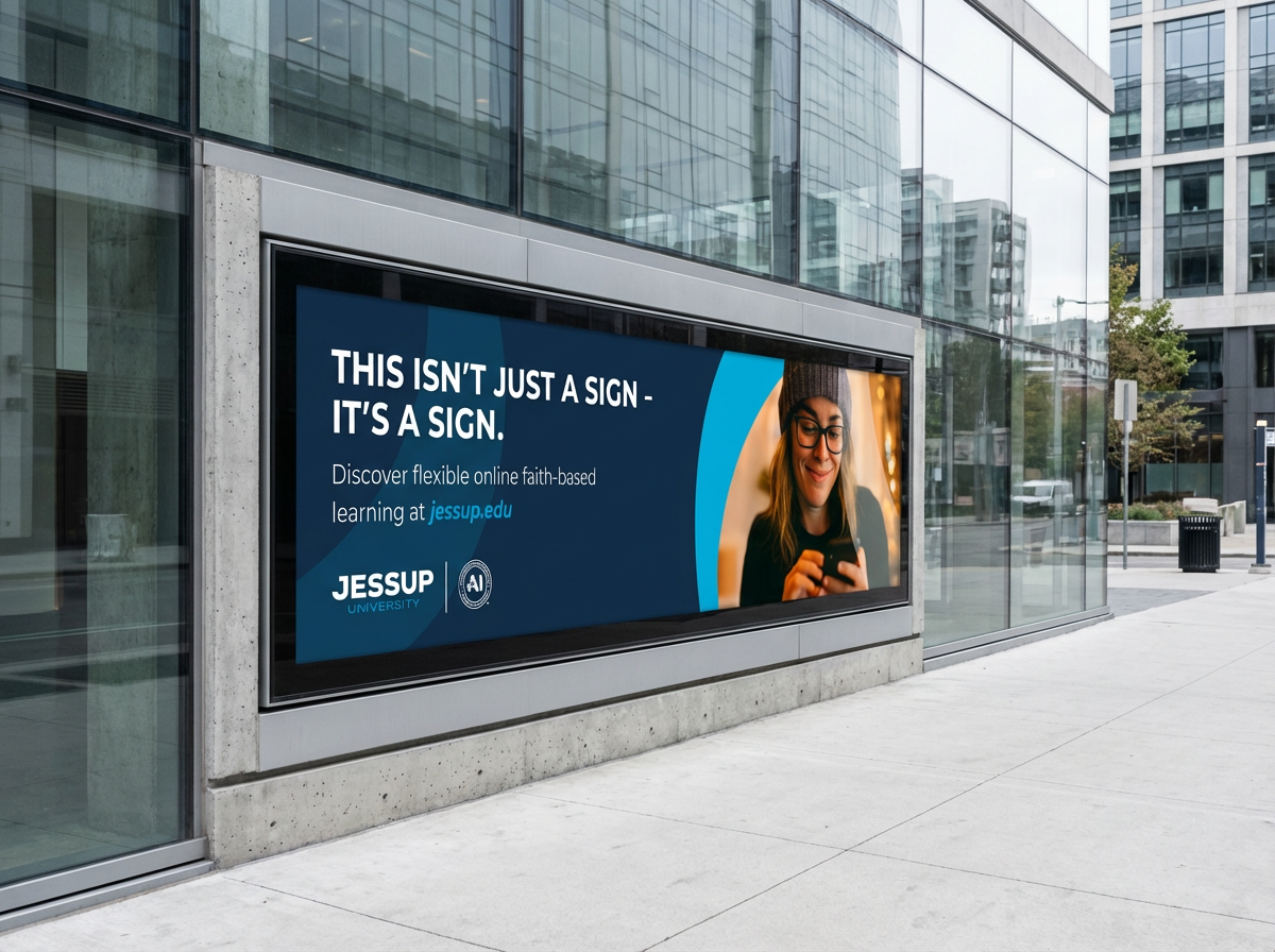
• OOH placements designed for instant recognition
• Program-specific creatives that balance consistency with personality
• Landing page templates designed to convert different audience mindsets
Each element was designed to work independently and as part of a larger whole.
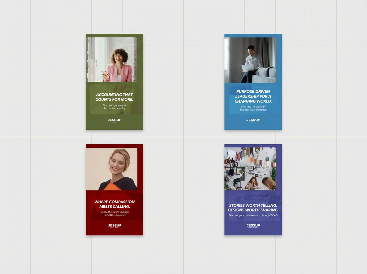
Social Content Framework
Social content was organized around four pillars to keep messaging focused and scalable:
1• Academic credibility and innovation
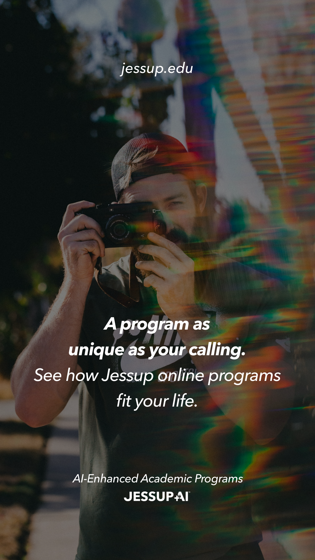
2• Flexible, personalized learning experiences
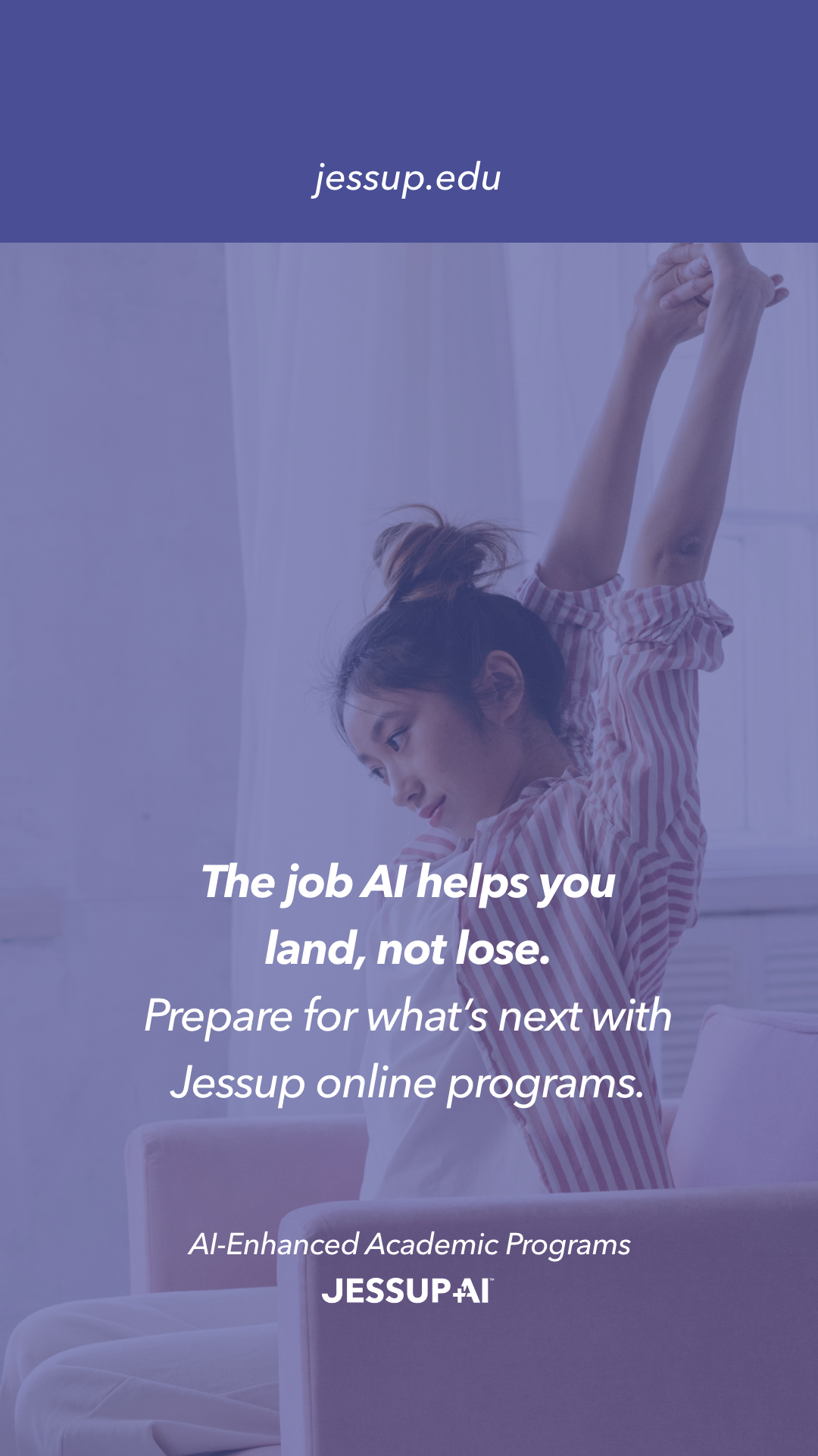
3• Career and leadership outcomes
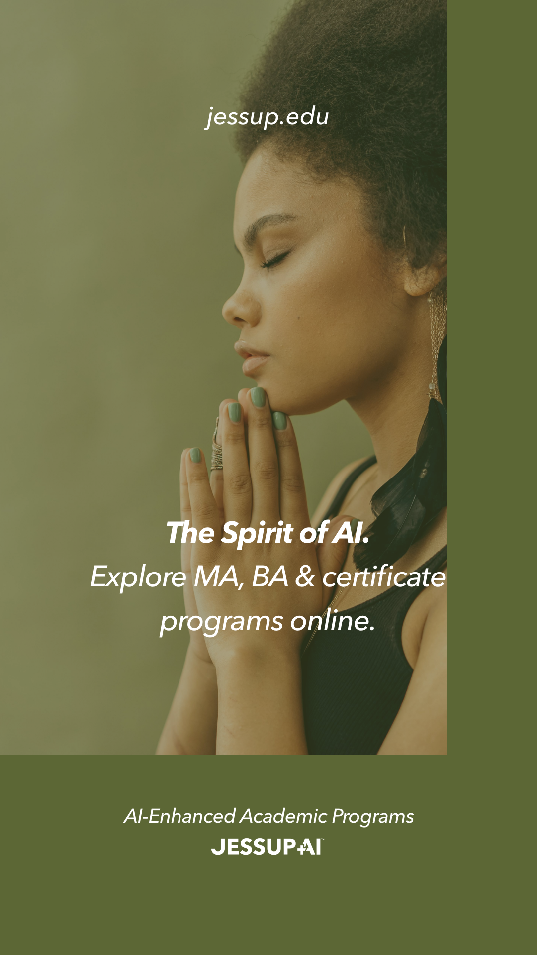
4• Faith, support, and community
This structure allowed the campaign to stay consistent while still speaking directly to different motivations.
Visual and Copy Direction
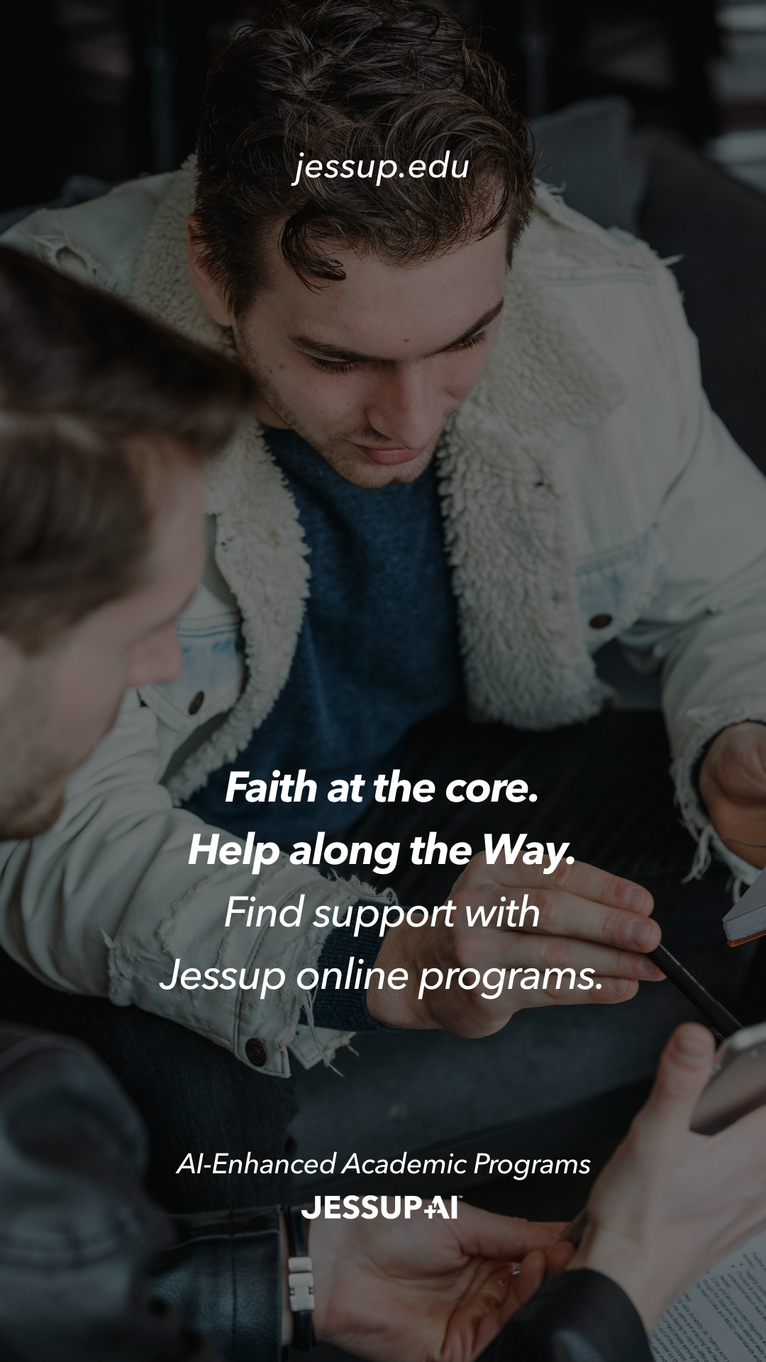
The visual system relies on documentary-style photography, confident typography, and intentional use of colour to unify a wide range of programs. Copy is short, direct, and conversational, designed to feel confident without sounding institutional.
AI tools were used throughout the process to speed up visual exploration, test compositions, and support production workflows. Creative direction and final decisions remained human and intentional.
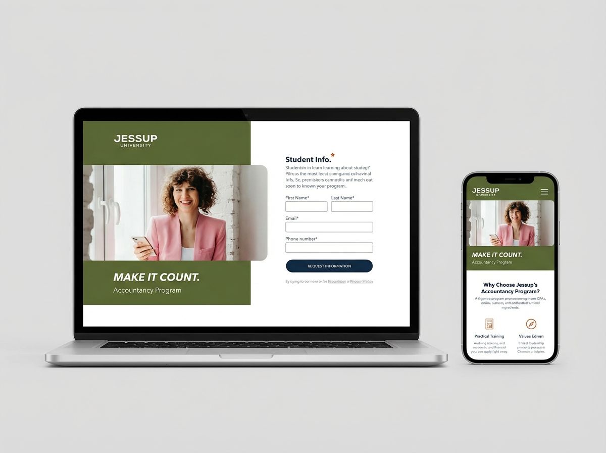
Landing Pages
Landing pages were designed to support different user mindsets. One focused on career-driven programs with outcomes-led messaging. The other centred on creative and calling-based programs, with a more expressive tone. Both followed the same layout logic to ensure clarity, accessibility, and consistency across programs.
Impact
• Improved clarity and approachability across digital touchpoints for a diverse audience of working professionals and prospective students.
• Supported higher-quality engagement by aligning messaging, visuals, and UX into a single, scalable campaign system.
• Enabled faster rollout of future programs by establishing a flexible visual and content framework.
Outcome
The result is a flexible campaign system that scales across platforms while maintaining a clear voice and visual identity. The work demonstrates how brand, content, and conversion can work together without sacrificing tone or craft.
Why This Project Matters
This project reflects how I approach art direction and design systems. I focus on building frameworks that adapt, messaging that stays human, and work that holds up beyond a single launch.
Helping education meet people where they are, not the other way around.